
The content we’re creating through our work with ASP.NET is almost never static. At design time, we tend to think in terms of templates that contain placeholders for the content that will be generated dynamically at runtime. And to fill those placeholders, we can either use one of the many controls ASP.NET provides, or build our own.
In this chapter of the fabulous new edition of Build Your Own ASP.NET 3.5 Web Site Using C# & VB, we’ll discuss many of the objects and techniques that give life and color to ASP.NET web pages, including:
- web forms
- HTML server controls
- web server controls
- web user controls
- master pages
- handling page navigation
- styling pages and controls with CSS
Web Forms
As you know, there’s always new terminology to master when you’re learning new technologies. The term used to describe an ASP.NET web page is web form, and this is the central object in ASP.NET development. At first glance, web forms look much like HTML pages, but in addition to static HTML content, they contain ASP.NET-specific elements, and code that executes on the server side.Every web form includes a
<form runat="server"> tag, which contains the ASP.NET-specific elements that make up the page. Multiple forms aren’t supported. The basic structure of a web form is shown here:
<%@ Page Language="language" %>

 <!DOCTYPE html PUBLIC "-//W3C//DTD XHTML 1.0 Transitional//EN"

      "http://www.w3.org/TR/xhtml1/DTD/xhtml1-transitional.dtd">


 <script runat="server">

    … code block…

 </script>


 <html xmlns="http://www.w3.org/1999/xhtml">

 <head runat="server">

  <title>Page Title</title>

 </head>

 <body>

  <form id="form1" runat="server">

    … user interface elements…

  </form>

 </body>

 </html>
System.Web.UI.Page class. We must mention the class explicitly in the code-behind file. In situations in which we’re not using code-behind files (that is, when we’re writing all the code inside the .aspx file instead), the Page class is still used—we just don’t see it.We can use a range of user interface elements inside the form—including typical static HTML code—but we can also use elements whose values or properties can be generated or manipulated on the server either when the page first loads, or when the form is submitted. These elements—which, in ASP.NET parlance, are called controls—allow us to reuse common functionality, such as the page header, a calendar, a shopping cart summary, or a “Today’s Quote” box, for example, across multiple web forms. There are several types of controls in ASP.NET:
- HTML server controls
- web server controls
- web user controls
- master pages
HTML Server Controls
HTML server controls are outwardly identical to plain old HTML tags, but include arunat="server"runat="server" attribute. attribute. This gives the ASP.NET runtime control over the HTML server controls, allowing us to access them programmatically. For example, if we have an <a> tag in a page and we want to be able to change the address to which it links dynamically, using VB or C# code, we use the A server-side HTML server control exists for each of HTML’s most common elements. Creating HTML server controls is easy: we simply stick a
runat="server" attribute on the end of a normal HTML tag to create the HTML control version of that tag. The complete list of current HTML control classes and their associated tags is given in Table 1.Table 1. HTML control classes
| Class | Associated Tags |
|---|---|
HtmlAnchor |
<a runat="server"> |
HtmlButton |
<button runat="server"> |
HtmlForm |
<form runat="server"> |
HtmlImage |
<img runat="server"> |
HtmlInputButton |
<input type="submit" runat="server"> |
HtmlInputCheckBox |
<input type="reset" runat="server"> |
<input type="button" runat="server"> |
|
<input type="checkbox" runat="server"> |
|
HtmlInputFile |
<input type="file" runat="server"> |
HtmlInputHidden |
<input type="hidden" runat="server"> |
HtmlInputImage |
<input type="image" runat="server"> |
HtmlInputRadioButton |
<input type="radio" runat="server"> |
HtmlInputText |
<input type="text" runat="server"> |
HtmlSelect |
<input type="password" runat="server"> |
<select runat="server"> |
|
HtmlTable |
<table runat="server"> |
HtmlTableRow |
<tr runat="server"> |
HtmlTableCell |
<td runat="server"> |
HtmlTextArea |
<th runat="server"> |
<textarea runat="server"> |
|
HtmlGenericControl |
<span runat="server"> |
<div runat="server"> |
|
| All other HTML tags |
System.Web.UI.HtmlControls namespace. As they’re processed on the server side by the ASP.NET runtime, we can access their properties through code elsewhere in the page. If you’re familiar with JavaScript, HTML, and CSS, you’ll know that manipulating text within HTML tags, or even manipulating inline styles within an HTML tag, can be cumbersome and error-prone. HTML server controls aim to solve these problems by allowing you to manipulate the page easily with your choice of .NET language—for instance, using VB or C#.Using the HTML Server Controls
Nothing explains the theory better than a simple, working example. Let’s create a simple survey form that uses the following HTML server controls:
-
HtmlForm -
HtmlButton -
HtmlInputText -
HtmlSelect
Survey.aspx. Create the file in the LearningASP\VB or LearningASP\CS folder that we cover in Chapter 1 of the downloadable pdf of this book. For the purpose of the exercises in this chapter we won’t be using a code-behind file, so don’t check the Place code in a separate file checkbox when you create the form.Update the automatically generated file with the following code to create the visual interface for the survey:
Visual Basic LearningASP\VB\Survey_01.aspx (excerpt)
<%@ Page Language="VB" %>


 <!DOCTYPE html PUBLIC "-//W3C//DTD XHTML 1.0 Transitional//EN"

    "http://www.w3.org/TR/xhtml1/DTD/xhtml1-transitional.dtd">


 <script runat="server">


 </script>


 <html xmlns="http://www.w3.org/1999/xhtml">

  <head runat="server">

    <title>Using ASP.NET HTML Server Controls</title>

  </head>

  <body>

    <form id="form1" runat="server">

    <div>

      <h1>Take the Survey!</h1>

      <!-- Display user name -->

      <p>

        Name:<br />

        <input type="text" id="name" runat="server" />

      </p>

      <!-- Display email -->

      <p>

        Email:<br />

        <input type="text" id="email" runat="server" />

      </p>

      <!-- Display technology options -->

      <p>

        Which server technologies do you use?<br />

        <select id="serverModel" runat="server" multiple="true">

          <option>ASP.NET</option>

          <option>PHP</option>

          <option>JSP</option>

          <option>CGI</option>

          <option>ColdFusion</option>

        </select>

      </p>

      <!-- Display .NET preference options -->

      <p>

        Do you like .NET so far?<br />

        <select id="likeDotNet" runat="server">

          <option>Yes</option>

          <option>No</option>

        </select>

      </p>

      <!-- Display confirmation button -->

      <p>

        <button id="confirmButton" OnServerClick="Click"

            runat="server">Confirm</button>

      </p>

      <!-- Confirmation label -->

      <p>

        <asp:Label id="feedbackLabel" runat="server" />

      </p>

    </div>

    </form>

  </body>

 </html>
The C# version is identical except for the first line—the page declaration:C# LearningASP\CS\Survey_01.aspx (excerpt)
<%@ Page Language="C#" %>

 …
From what we’ve already seen of HTML controls, you should have a good idea of the classes we’ll be working with in this page. All we’ve done is place some
HtmlInputTextcontrols, an HtmlButtoncontrol, and an HtmlSelect control inside the obligatory HtmlForm control. We’ve also added a Label control, which we’ll use to give feedback to the user.TIP: HTML Server Controls in Action
Remember, HTML server controls are essentially HTML tags with the
runat="server" attribute. In most cases, you’ll also need to assign them IDs, which will enable you to use the controls in your code.NOTE: Validation Warnings
You may notice that Visual Web Developer will display a validation warning about the
multiple=”true” attribute value on the selectelement. In XHTML 1.0, the select element only supports multiple=”multiple” and the IDE dutifully reports the problem. However, since this is a server control—it has a runat="server" attribute—you must specify multiple=”true”, otherwise the page will not compile and execute. When you eventually test this page, you’ll be happy to note that ASP.NET will change the attribute value to
multiple=”multiple” when the HTML is generated and the page is displayed.When it’s complete, and you view it in Visual Web Developer’s
Design mode, the Survey.aspx web form will resemble Figure 1. Note that you can’t execute the form yet, because it’s missing the button’s Clickevent handler that we’ve specified using the OnServerClick attribute on the HtmlButton control.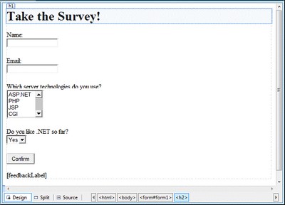
When a user clicks on the
Confirm button, we’ll display the submitted responses in the browser. In a real application, we’d probably be more likely to save this information to a database, and perhaps show the results as a chart. Whatever the case, the code for the Click event handler method below shows how we’d access the properties of the HTML controls:Visual Basic LearningASP\VB\Survey_02.aspx (excerpt)
<script runat="server">

    Sub Click(ByVal s As Object, ByVal e As EventArgs)

       Dim i As Integer

       feedbackLabel.Text = "Your name is: " & name.Value & "<br />"

       feedbackLabel.Text += "Your email is: " & email.Value & _

           "<br />"

       feedbackLabel.Text += "You like to work with:<br />"

       For i = 0 To serverModel.Items.Count - 1

         If serverModel.Items(i).Selected Then

           feedbackLabel.Text += " - " & _

               serverModel.Items(i).Text & "<br />"

         End If

       Next i

       feedbackLabel.Text += "You like .NET: " & likeDotNet.Value

     End Sub

    </script>
C# LearningASP\CS\Survey_02.aspx (excerpt)
 <script runat="server">

    void Click(Object s, EventArgs e)

     {

       feedbackLabel.Text = "Your name is: " + name.Value + "<br />";

       feedbackLabel.Text += "Your email is: " + email.Value +

           "<br />";

       feedbackLabel.Text += "You like to work with:<br />";

       for (int i = 0; i <= serverModel.Items.Count - 1; i++)

       {

         if (serverModel.Items[i].Selected)

         {

           feedbackLabel.Text += " - " + serverModel.Items[i].Text +

               "<br />";

         }

       }

       feedbackLabel.Text += "You like .NET: " + likeDotNet.Value;

     }

    </script>
As with the examples we’ve seen in previous chapters, we start by placing our VB and C# code inside a server-side script block within the
<script> part of the page. Next, we create a new Click event handler that takes the two usual parameters. Finally, we use the Label control to display the user’s responses within the page.Once you’ve written the code, save your work and test the results in your browser. Enter some information and click the button. To select multiple options in the
serverModel option box, hold down Ctrl as you click on your preferences. The information you enter should appear at the bottom of the page when the Confirm button is clicked, as shown in Figure 2.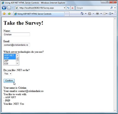
In conclusion, working with HTML server controls is really simple. All you need to do is assign each control an ID, and add the
runat="server" attribute. Then, you can simply access and manipulate the controls using VB or C# code on the server side.
Web Server Controls
Web server controls can be seen as advanced versions of HTML server controls. Web server controls are those that generate content for you—you’re no longer in control of the HTML being used. While having good knowledge of HTML is useful, it’s not a necessity for those working with web server controls.
Let’s look at an example. We can use the
Label web server control to place simple text inside a web form. To change the Label’s text from within our C# or VB code, we simply set its Text property like so:Visual Basic
myLabel.Text = "Mickey Mouse"Similarly, to add a text box to our form, we use the
TextBox web server control. Again, we can read or set its text using the Text property:C#
username = usernameTextBox.Text;Though we’re applying the
TextBox control, ASP.NET still uses an input element behind the scenes; however, we no longer have to worry about this detail. With web server controls, you no longer need to worry about translating the needs of your application into elements you can define in HTML—you can let the ASP.NET framework do the worrying for you.Unlike HTML server controls, web server controls don’t have a direct, one-to-one correspondence with the HTML elements they generate. For example, we can use either of two web server controls—the
DropDownList control, or the ListBox control—to generate a select element.Web server controls follow the same basic pattern as HTML tags, but the tag name is preceded by
asp:, and is capitalized using Pascal Casing. Pascal Casing is a form that capitalizes the first character of each word (such as TextBox). The object IDs are usually named using Camel Casing, where the first letter of each word except the first is capitalized (e.g. usernameTextBox).Consider the following HTML
input element, which creates an input text box:<input type="text" name="usernameTextBox" size="30" />The equivalent web server control is the
TextBox control, and it looks like this:<asp:TextBox id="usernameTextBox" runat="server" Columns="30"></asp:TextBox>Remember that, unlike any normal HTML that you might use in your web forms, web server controls are first processed by the ASP.NET engine, where they’re transformed to HTML. A side effect of this approach is that you must be very careful to always include closing tags (the
</asp:TextBox> part above). The HTML parsers of most web browsers are forgiving about badly formatted HTML code, but ASP.NET is not. Remember that you can use the shorthand syntax (/>) if nothing appears between your web server control’s opening and closing tags. As such, you could also write this TextBox like so:<asp:TextBox id="usernameTextBox" runat="server" Columns="30" />To sum up, the key points to remember when you’re working with web server controls are:
- Web server controls must be placed within a
<form runat="server">tag to function properly. - Web server controls require the
runat="server"attribute to function properly. - We include web server controls in a form using the
asp:prefix.
There are more web server controls than HTML controls. Some offer advanced features that simply aren’t available using HTML alone, and some generate quite complex HTML code for you. We’ll meet many web server controls as we work through this and future chapters in the book. For more information on web server controls, including the properties, methods, and events for each, have a look at Appendix A of this book.
Standard Web Server Controls
The standard set of web server controls that comes with ASP.NET mirrors the HTML server controls in many ways. However, web server controls offer some new refinements and enhancements, such as support for events and view state, a more consistent set of properties and methods, and more built-in functionality. In this section, we’ll take a look as some of the controls you’re most likely to use in your day-to-day work.
Remember to use the .NET Framework SDK Documentation whenever you need more details about any of the framework’s classes (or controls). You can access the documentation from the
Help > IndexIndex Results window. For example, you’ll find that there are two classes named Label, located in the System.Web.UI.WebControls and System.Windows.Forms namespaces, as Figure 3 illustrates. You’ll most likely be interested in the version of the class situated in the WebControls namespace. menu item in Visual Web Developer. To find a class, simply search for the class’s name. If there are many classes with a given name in different namespaces, you’ll be able to choose the one you want from the 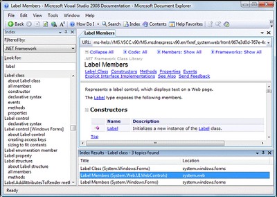
LabelThe easiest way to display static text on your page is simply to add the text to the body of the page without enclosing it in a tag. However, if you want to modify the text displayed on a page using ASP.NET code, you can display your text within a
Label control. Here’s a typical example:<asp:Label id="messageLabel" Text="" runat="server" />The following code sets the
Text property of the Label control to display the text “Hello World”:Visual Basic
Reading thisPublic Sub Page_Load()
messageLabel.Text = "Hello World"
End Sub
C#
 public void Page_Load()
 {
  messageLabel.Text = "Hello World";
 }
Page_Load handler code, we can see that when the page first loads, the Text property of the Label control with the id of message will be set to “Hello World.”LiteralThis is perhaps the simplest control in ASP.NET. If you set
Literal’s Text property, it will simply insert that text into the output HTML code without altering it. Unlike Label, which has similar functionality, Literal doesn’t wrap the text in TextBoxThe
TextBox control is used to create a box in which the user can type or read standard text. You can use the TextMode
property to set this control to display text in a single line, across
multiple lines, or to hide the text being entered (for instance, in
HTML password fields). The following code shows how we might use it in
a simple login page:
<p>
 Username: <asp:TextBox id="userTextBox" TextMode="SingleLine"
   Columns="30" runat="server" />
</p>
<p>
 Password: <asp:TextBox id="passwordTextBox"
     TextMode="Password" Columns="30" runat="server" />
</p>
<p>
 Comments: <asp:TextBox id="commentsTextBox"
     TextMode="MultiLine" Columns="30" Rows="10"
     runat="server" />
</p>
In each of the instances above, the TextMode attribute dictates the kind of text box that’s to be rendered.HiddenFieldHiddenField is a simple control that renders an input element whose type attribute is set to hidden. We can set its only important property, Value.ButtonBy default, the
Button control renders an input element whose type attribute is set to submit. When a button is clicked, the form containing the button is submitted to the server for processing, and both the ClickCommand events are raised. and The following markup displays a
Button control and a Label:
<asp:Button id="submitButton" Text="Submit" runat="server"
   OnClick="WriteText" />
<asp:Label id="messageLabel" runat="server" />
Notice the OnClick attribute on the control. When the button is clicked, the Click event is raised, and the WriteText subroutine is called. The WriteText subroutine will contain the code that performs the intended function for this button, such as displaying a message to the user:Visual Basic
Public Sub WriteText(s As Object, e As EventArgs)
  messageLabel.Text = "Hello World"
 End Sub
C#
 public void WriteText(Object s, EventArgs e)
 {
    messageLabel.Text = "Hello World";
 }
It’s
important to realize that events are associated with most web server
controls, and the basic techniques involved in using them, are the same
events and techniques we used with the Click event of the ButtonWebControl base class. control. All controls implement a standard set of events because they all inherit from the ImageButtonAn
ImageButton control is similar to a Button control, but it uses an image that we supply in place of the typical system button graphic. Take a look at this example:
<asp:ImageButton id="myImgButton" ImageUrl="myButton.gif"
   runat="server" OnClick="WriteText" />
<asp:Label id="messageLabel" runat="server" />
The Click event of the ImageButton receives the coordinates of the point at which the image was clicked:Visual Basic
 Public Sub WriteText(s As Object, e As ImageClickEventArgs)
  messageLabel.Text = "Coordinate: " & e.X & "," & e.Y
 End Sub
C#
public void WriteText(Object s, ImageClickEventArgs e)
 {
  messageLabel.Text = "Coordinate: " + e.X + "," + e.Y;
 }
LinkButtonA
LinkButton control renders a hyperlink that fires the Click event when it’s clicked. From the point of view of ASP.NET code, LinkButtons can be treated in much the same way as buttons, hence the name. Here’s LinkButton in action:<asp:LinkButton id="myLinkButon" Text="Click Here"
runat="server" />HyperLinkThe
HyperLink control creates on your page a hyperlink that links to the URL in the NavigateUrlLinkButton control, which offers features such as Click events and validation, HyperLinks are meant to be used to navigate from one page to the next: property. Unlike the <asp:HyperLink id="myLink" NavigateUrl="http://www.sitepoint.com/"
ImageUrl="splogo.gif" runat="server">SitePoint</asp:HyperLink>If it’s specified, the
ImageUrl
attribute causes the control to display the specified image, in which
case the text is demoted to acting as the image’s alternate text.CheckBoxYou can use a
CheckBox control to represent a choice that can have only two possible states—checked or unchecked:<asp:CheckBox id="questionCheck" Text="Yep, ASP.NET is cool!"
Checked="True" runat="server" />The main event associated with a
CheckBox is the CheckChanged event, which can be handled with the OnCheckChanged attribute. The Checked property is True if the checkbox is checked, and False otherwise.RadioButtonA
RadioButton is a lot like a CheckBox, except that RadioButtons can be grouped to represent a set of options from which only one can be selected. Radio buttons are grouped together using the GroupName property, like so:
<asp:RadioButton id="sanDiego" GroupName="City" Text="San Diego"
   runat="server" /><br /><asp:RadioButton id="boston" GroupName="City" Text="Boston"
   runat="server" /><br /><asp:RadioButton id="phoenix" GroupName="City" Text="Phoenix"
   runat="server" /><br /><asp:RadioButton id="seattle" GroupName="City" Text="Seattle"
   runat="server" />
Like the CheckBox control, the main event associated with RadioButtons is the CheckChanged event, which can be handled with the OnCheckChanged attribute. The other control we can use to display radio buttons is RadioButtonList, which we’ll also meet in this chapter.ImageAn
Image control creates an image that can be accessed dynamically from code; it equates to the ![]()
<asp:Image id="myImage" ImageUrl="mygif.gif" runat="server"
AlternateText="description" />ImageMapThe
ImageMap control generates HTML to display images that have certain clickable regions called hot spots. Each hot spot reacts in a specific way when it’s clicked by the user.These areas can be defined using three controls, which generate hot spots of different shapes:
CircleHotSpot, RectangleHotSpot, and PolygonHotSpot. Here’s an example that defines an image map with two circular hot spots:
<asp:ImageMap ID="myImageMap" runat="server" ImageUrl="image.jpg">   <asp:CircleHotSpot AlternateText="Button1"

         Radius="20" X="50" Y="50" />

      <asp:CircleHotSpot AlternateText="Button2"

         Radius="20" X="100" Y="50" />

    </asp:ImageMap>
Table 2. Possible values of
HotSpotModeHotSpotMode value | Behavior when hot spot is clicked |
|---|---|
Inactive | none |
Navigate | The user is navigated to the specified URL. |
NotSet | When this value is set for a HotSpot, the behavior is inherited from the parent ImageMap; if the parent ImageMap doesn’t specify a defaultvalue, Navigate is set. |
When it’s set for an ImageMap, this value is effectively equivalent to Navigate. | |
PostBack | The hot spot raises the Clickevent that can be handled on the server side to respond to the user action. |
To configure the action that results when a hot spot is clicked by the user, we set the
HotSpotModeImageMap control, or the HotSpotMode property of the individual hot spot objects, or both, using the values shown in Table 2. If the HotSpotMode property is set for the ImageMap control as well as for an individual hot spot, the latter property will override that set for the more general ImageMap control. property of the The Microsoft .NET Framework SDK Documentation for the
ImageMap class and HotSpotMode enumeration contains detailed examples of the usage of these values.PlaceHolderThe
PlaceHolder control lets us add elements at a particular place on a page at any time, dynamically, through our code. Here’s what it looks like:<asp:PlaceHolder id="myPlaceHolder" runat="server" />The following code dynamically adds a new
HtmlButton control within the placeholder:Visual Basic
Public Sub Page_Load()

     Dim myButton As HtmlButton = New HtmlButton()

     myButton.InnerText = "My New Button"

     myPlaceHolder.Controls.Add(myButton)

    End Sub
C#
public void Page_Load()

    {

     HtmlButton myButton = new HtmlButton();

     myButton.InnerText = "My New Button";

     myPlaceHolder.Controls.Add(myButton);

    }
PanelThe
Panel control functions similarly to the div element in HTML, in that it allows the set of items that resides within the tag to be manipulated as a group. For instance, the Panel could be made visible or hidden by a Button’s Click event:
<asp:Panel id="myPanel" runat="server">

     <p>Username: <asp:TextBox id="usernameTextBox" Columns="30"

         runat="server" /></p>

    <p>Password: <asp:TextBox id="passwordTextBox"

         TextMode="Password" Columns="30" runat="server" /></p>

    </asp:Panel>

    <asp:Button id="hideButton" Text="Hide Panel" OnClick="HidePanel"

       runat="server" />
The code above places two
TextBox controls within a Panel control. The Button control is outside of the panel. The HidePanel subroutine would then control the Panel’s visibility by setting its VisibleFalse: property to Visual Basic
Public Sub HidePanel(s As Object, e As EventArgs)

     myPanel.Visible = False

    End Sub
C#
public void HidePanel(Object s, EventArgs e)

    {

     myPanel.Visible = false;

    }
In this case, when the user clicks the button, the
Click event is raised and the HidePanel subroutine is called, which sets the Visible property of the Panel control to False.List Controls
Here, we’ll meet the ASP.NET controls that display simple lists of elements:
ListBox, DropDownList, CheckBoxList, RadioButtonList, and BulletedList.DropDownListA
DropDownList control is similar to the HTML select element. The DropDownList control allows you to select one item from a list using a drop-down menu. Here’s an example of the control’s code:<asp:DropDownList id="ddlFavColor" runat="server">
<asp:ListItem Text="Red" value="red" />
<asp:ListItem Text="Blue" value="blue" />
<asp:ListItem Text="Green" value="green" />
</asp:DropDownList>The most useful event that this control provides is
SelectedIndexChanged. This event is also exposed by other list controls, such as the CheckBoxList and RadioButtonList controls, allowing for easy programmatic interaction with the control you’re using. These controls can also be bound to a database and used to extract dynamic content into a drop-down menu.ListBoxA
ListBox control equates to the HTML select element with either the multiple or size attribute set (size would need to be set to a value of 2 or more). If you set the SelectionMode attribute to Multiple, the user will be able to select more than one item from the list, as in this example:
<asp:ListBox id="listTechnologies" runat="server"

       SelectionMode="Multiple">

     <asp:ListItem Text="ASP.NET" Value="aspnet" />

     <asp:ListItem Text="JSP" Value="jsp" />

     <asp:ListItem Text="PHP" Value="php" />

     <asp:ListItem Text="CGI" Value="cgi" />

     <asp:ListItem Text="ColdFusion" Value="cf" />

    </asp:ListBox>
RadioButtonListLike the
RadioButton control, the RadioButtonList control represents radio buttons. However, the RadioButtonList control represents a list of radio buttons and uses more compact syntax. Here’s an example:
<asp:RadioButtonList id="favoriteColor" runat="server">

     <asp:ListItem Text="Red" Value="red" />

     <asp:ListItem Text="Blue" Value="blue" />

     <asp:ListItem Text="Green" Value="green" />

    </asp:RadioButtonList>
CheckBoxListAs you may have guessed, the
CheckBoxList control represents a group of check boxes; it’s equivalent to using several CheckBox controls in a row:
<asp:CheckBoxList id="favoriteFood" runat="server">

     <asp:ListItem Text="Pizza" Value="pizza" />

     <asp:ListItem Text="Tacos" Value="tacos" />

     <asp:ListItem Text="Pasta" Value="pasta" />

    </asp:CheckBoxList>
BulletedListThe
BulletedList control displays bulleted or numbered lists, using <ul> (unordered list) or <ol> (ordered list) tags. Unlike the other list controls, the BulletedList doesn’t allow the selection of items, so the SelectedIndexChanged event isn’t supported.The first property you’ll want to set is
DisplayMode, which can be Text(the default), or HyperLink, which will render the list items as links. When DisplayMode is set to HyperLink, you can use the Click event to respond to a user’s click on one of the items.The other important property is
BulletStyle, which determines the style of the bullets. The accepted values are:-
Numbered(1, 2, 3, …) -
LowerAlpha(a, b, c, …) -
UpperAlpha(A, B, C, …)
LowerRoman(i, ii, iii, …)-
UpperRoman(I, II, III, …) -
Circle -
Disc -
Square -
CustomImage
If the style is set to
CustomImage, you’ll also need to set the BulletStyleImageUrl to specify the image to be used for the bullets. If the style is one of the numbered lists, you can also set the FirstBulletNumber property to specify the first number or letter that’s to be generated.Advanced Controls
These controls are advanced in terms of their usage, the HTML code they generate, and the background work they do for you. Some of these controls aren’t available to older versions of ASP.NET.
CalendarThe
Calendar is a great example of the reusable nature of ASP.NET controls. The Calendar control generates markup that displays an intuitive calendar in which the user can click to select, or move between, days, weeks, months, and so on.The
Calendar control requires very little customization. In Visual Web Developer, select Website > Add New Item…, and make the changes indicated:Visual Basic LearningASP\VB\Calendar_01.aspx
<%@ Page Language="VB" %><!DOCTYPE html PUBLIC "-//W3C//DTD XHTML 1.0 Transitional//EN""http://www.w3.org/TR/xhtml1/DTD/xhtml1-transitional.dtd"><script runat="server"></script><html xmlns="http://www.w3.org/1999/xhtml"><head runat="server"><title>Calendar Test/title></head><body><form id="form1" runat="server"><div><asp:Calendar ID="myCalendar" runat="server" /></div></form></body></html>
Again, the C# version is the same, except for the
Page declaration:C# LearningASP\CS\01_Calendar.aspx (excerpt)
<%@ Page Language="C#" %>
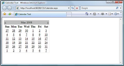
…If you save this page in your working folder and load it, you’ll see the output shown in Figure 4.
The
Calendar control contains a wide range of properties, methods, and events, including those listed in Table 3.Table 3. Some of the
Calendar control’s propertiesProperty | Description |
|---|---|
DayNameFormat | This property sets the format of the day names. Its possible values are FirstLetter, FirstTwoLetters, Full, and Short. The default is Short, which displays the three-letter abbreviation. |
FirstDayOfWeek | This property sets the day that begins each week in the calendar. By default, the value of this property is determined by your server’s region settings, but you can set this to Sundayor Monday if you want to control it. |
NextPrevFormat | Set to CustomText by default, this property can be set to ShortMonth or FullMonth to control the format of the next and previous month links. |
SelectedDate | This property contains a DateTime value that specifies the highlighted day. You’ll use this property often, to determine which date the user has selected. |
SelectionMode | This property determines whether days, weeks, or months can be selected; its possible values are Day, DayWeek, DayWeekMonth, and None, and the default is Day. When Dayis selected, a user can only select a day; when DayWeek is selected, a user can select a day or an entire week; and so on. |
SelectMonthText | This property controls the text of the link that’s displayed to allow users to select an entire month from the calendar. |
SelectWeekText | This property controls the text of the link that’s displayed to allow users to select an entire week from the calendar. |
ShowDayHeader | If True, this property displays the names of the days of the week. The default is True. |
ShowGridLines | If True, this property renders the calendar with grid lines. The default is True. |
ShowNextPrevMonth | If True, this property displays next month and previous month links. The default is True. |
ShowTitle | If True, this property displays the calendar’s title. The default is False |
TitleFormat | This property determines how the month name appears in the title bar. Possible values are Monthand MonthYear. The default is MonthYear. |
TodaysDate | This DateTime value sets the calendar’s current date. By default, this value is not highlighted within the Calendar control. |
VisibleDate | This DateTime value controls which month is displayed. |
Let’s take a look at an example that uses some of these properties, events, and methods to create a
Calendar control which allows users to select days, weeks, and months. Modify the calendar in Calendar.aspx (both the VB and C# versions), and add a label to it, as follows:LearningASP\VB\Calendar_02.aspx (excerpt)
…
<form id="form1" runat="server"><div><h1>Pick your dates:</h1><asp:Calendar ID="myCalendar" runat="server"DayNameFormat="Short" FirstDayOfWeek="Sunday"NextPrevFormat="FullMonth" SelectionMode="DayWeekMonth"SelectWeekText="Select Week"SelectMonthText="Select Month" TitleFormat="Month"OnSelectionChanged="SelectionChanged" /><h1>You selected these dates:</h1><asp:Label ID="myLabel" runat="server" /></div></form>
…Now edit the
<script runat="server"> tag to include the SelectionChanged event handler referenced by your calendar:Visual Basic LearningASP\VB\Calendar_02.aspx (excerpt)
<script runat="server">

     Sub SelectionChanged(ByVal s As Object, ByVal e As EventArgs)

       myLabel.Text = ""

       For Each d As DateTime In myCalendar.SelectedDates

         myLabel.Text &= d.ToString("D") & "<br />"

       Next

     End Sub

    </script>
C# LearningASP\CS\Calendar_02.aspx (excerpt)
<script runat="server">

     void SelectionChanged(Object s, EventArgs e)

     {

       myLabel.Text = "";

       foreach (DateTime d in myCalendar.SelectedDates)

       {

         myLabel.Text += d.ToString("D") + "<br />";

       }

     }

    </script>
Save your work and test it in a browser. Try selecting a day, week, or month. The selection will be highlighted in a similar way to the display shown in Figure 5.
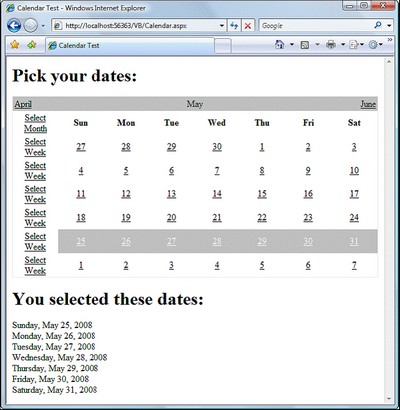
In
SelectionChanged, we loop through each of the dates that the user has selected, and append each to the Label we added to the page.AdRotatorThe
AdRotator control allows you to display a list of banner advertisements at random within your web application. However, it’s more than a mere substitute for creating a randomization script from scratch. Since the AdRotator control gets its content from an XML file, the administration and updating of banner advertisement files and their properties is a snap. Also, the XML file allows you to control the banner’s image, link, link target, and frequency of appearance in relation to other banner ads.The benefits of using this control don’t stop there, though. Most of the
AdRotator control’s properties reside within an XML file; if you wanted to, you could share that XML file on the Web, allowing value added resellers (VARS), or possibly your companies’ partners, to use your banner advertisements on their web sites.NOTE: What Is XML?
In essence, XML is simply a text-based format for the transfer or storage of data; it contains no details about how that data should be presented. XML is very easy to start with because of its close resemblance to your old friend HTML: both are largely comprised of tags inside angle brackets (
< and >), and any tag may contain attributes that are specific to that tag. The biggest difference between XML and HTML is that, rather than providing a fixed set of tags as HTML does, XML allows us to create our own tags to describe the data we wish to represent. Take a look at the following HTML element:
<h1>Star Wars Episode I: The Phantom Menace</h1> This example describes the content between the tags as a level one heading. This is fine if all we want to do is display the heading “Star Wars Episode I: The Phantom Menace” on a web page. But what if we want to access those words as data?
Like HTML, XML’s purpose is to describe the content of a document. But where HTML is a very generic markup language for documents—headings, paragraphs and lists, for example—XML can, very specifically, describe what the content is. Using XML, the web author can mark up the contents of a document, describing that content in terms of its relevance as data.
We can use XML to mark up the words “Star Wars Episode I: The Phantom Menace” in a way that better reflects this content’s significance as data:
<film>

     <title>Star Wars Episode I: The Phantom Menace</title>

    </film>
Here, the XML tag names we’ve chosen best describe the contents of the element. We also define our own attribute names as necessary. For instance, in the example above, you may decide that you want to differentiate between the VHS version and the DVD version of the film, or record the name of the movie’s director. This can be achieved by adding attributes and elements, as shown below:
<film format="DVD">

     <title>Star Wars Episode I: The Phantom Menace</title>

     <director>George Lucas</director>

    </film>
If you want to test this control out, create a file called
ads.xml in your LearningASP\VB or /#c#/LearningASP\CS folder (or both), and insert the content presented below. Feel free to create your own banners, or to use those provided in the code archive for this book:LearningASP\VB\Ads.xml
<?xml version="1.0" encoding="utf-8" ?>

    <Advertisements>

     <Ad>

       <ImageUrl>workatdorknozzle.gif</ImageUrl>

       <NavigateUrl>http://www.example.com</NavigateUrl>

       <TargetUrl>_blank</TargetUrl>

       <AlternateText>Work at Dorknozzle!</AlternateText>

       <Keyword>HR Sites</Keyword>

       <Impressions>2</Impressions>

     </Ad>

     <Ad>

       <ImageUrl>getthenewsletter.gif</ImageUrl>

       <NavigateUrl>http://www.example.com</NavigateUrl>

       <TargetUrl>_blank</TargetUrl>

       <AlternateText>Get the Nozzle Newsletter!</AlternateText>

       <Keyword>Marketing Sites</Keyword>

       <Impressions>1</Impressions>

     </Ad>

    </Advertisements>
As you can see, the
Advertisements element is the root node, and in accordance with the XML specification, it appears only once. For each individual advertisement, we simply add an Ad child element. For instance, the above advertisement file contains details for two banner advertisements.As you’ve probably noticed by now, the
.xml file enables you to specify properties for each banner advertisement by inserting appropriate elements inside each of the Ad elements. These elements include:ImageURLthe URL of the image to display for the banner ad
NavigateURLthe web page to which your users will navigate when they click the banner ad
AlternateTextthe alternative text to display for browsers that don’t support images
Keywordthe keyword to use to categorize your banner ad
(If you use the
KeywordFilter property of the AdRotator control, you can specify the categories of banner ads to display.)Impressionsthe relative frequency with which a particular banner ad should be shown in relation to other banner advertisements
(The higher this number, the more frequently that specific banner will display in the browser. The number provided for this element can be as low as one, but cannot exceed 2,048,000,000; if it does, the page throws an exception.)
Except for
ImageURL, all these elements are optional. Also, if you specify an Ad without a NavigateURL, the banner ad will display without a hyperlink.To make use of this
Ads.xml file, create a new ASP.NET page called AdRotator.aspx, and add the following code to it:Visual Basic LearningASP\VB\AdRotator.aspx
<%@ Page Language="VB" %>


    <!DOCTYPE html PUBLIC "-//W3C//DTD XHTML 1.0 Transitional//EN"

       "http://www.w3.org/TR/xhtml1/DTD/xhtml1-transitional.dtd">


    <script runat="server">


    </script>


    <html xmlns="http://www.w3.org/1999/xhtml">

     <head runat="server">

       <title>Using the AdRotator Control</title>

    </head>

    <body>

       <form id="form1" runat="server">

       <div>

         <asp:AdRotator ID="adRotator" runat="server"

           AdvertisementFile="Ads.xml" />

       </div>

       </form>

     </body>

    </html>
As with most of our examples, the C# version of this code is the same except for the
Page declaration. You’ll also need to copy the workatdorknozzle.gif and getthenewsletter.gif image files from the code archive and place them in your working folder in order to see these ad images. Save your work and test it in the browser; the display should look something like Figure 6.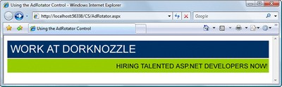
Refresh the page a few times, and you’ll notice that the first banner appears more often than the second. This occurs because the
Impression value for the first Ad is double the value set for the second banner, so it will appear twice as often.


I like about all yout articles, would you exchange link with me?
ReplyDeleteVery nice Article
ReplyDeleteIs it possible to change language of keyboard using Asp.Net
If you are looking to do some performance tuning, there are a lot of different tools to help you find and optimize performance for ASP.NET. I made a great list of 9 different types of tools. Check it out and see if any of these can help: ASP.NET Performance: 9 Types of Tools You Need to Know!
ReplyDelete